How to: better itch.io page for your game jam submission
During the last game jam I joined (The GameDev.tv Game Jam 2022), I saw a lot of people create the WebGL version of the submission.
Here are a few suggestions on what to do to make the page a bit better looking.
1.
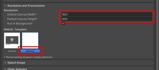
If you are working with Unity3D same as me, in the Player Settings -> Settings for WebGL, set some reasonable resolution.
To me, 900x600px works well.
Also, select the Minimal WebGL template, it will remove all the labels around your game.
For other frameworks/engines, the same resolution recommendation should be applied.

2.
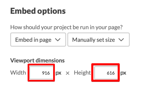
In the itch.io page of your game set the viewport dimensions.
It should be set to the size of canvas size + 16px, in my setup it's 916x616px.
The game canvas will be aligned nicely, not trimmed.

3.
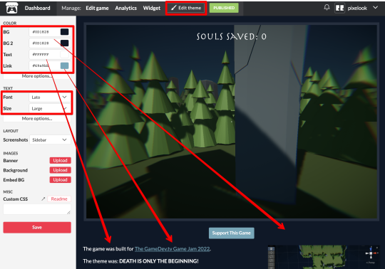
On the game page, hit the Edit theme.
You will see the settings panel on the left side.
Here you can do some final touch, e.g. set the colors and/or font.
The best is when you pick something very close to the game theme/mood.

And that’s it, three steps, three minutes, and the game page looks much better.
Keep creating, keep playing!
Cheers!
Comments
Log in with itch.io to leave a comment.
TY very much for putting this info on the interweeb.
Nicely done.